")
23 July 2025  Rubal Saluja
Marketing Strategy
Rubal Saluja
Marketing Strategy
You know that feeling, right? You see an ad campaign. It's glossy. It's slick. Honestly? It's gorgeous. And you think, "Okay, yeah, that is going to crush it!" Then... crickets. Or worse, it just sort of... evaporates.
Here's the brutal truth, and trust me, after 15+ years in this insane marketing game, I've seen this movie play out a million times:
A stunning campaign that doesn't actually connect? That’s not marketing. That's just really, really expensive digital art.
I've literally watched brands get obsessed. And I mean, like, obsessed with colours, fonts, those fancy transitions, slapping celebrity faces on everything, weird random swooshes on packaging, even the lighting has to be perfect. All while completely skipping the absolute basics. You know, like: Who are we even talking to? Why on earth should they actually care? And what, precisely, do we want them to do next?
Aesthetics? Sure, they might get you a quick blink. A tiny flash of attention. But strategy? That’s what keeps you stuck in people’s heads. And, way, way more importantly, gets them to actually choose you. Think about it.
When Design's in the Driver's Seat and Strategy's in the Trunk? Yeah, That's How Things Go Sideways. Fast.
Especially out here in India, where everyone's attention is just, like, fractured into a bazillion pieces, and choices? So, if a brand just looks “nice” and nothing more, it often gets lost in the crowd—just disappears.
So, let’s dive in. I’ll walk you through some real examples—the good ones, the bad ones, and even the messy ones that somehow work really well.
The Campaigns That Just Nailed the Strategy (Bless Their Hearts)
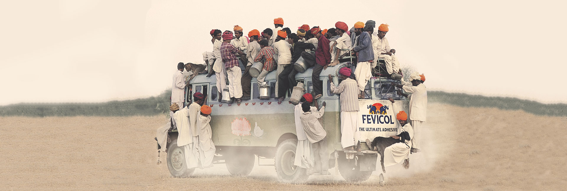
Fevicol’s Bus Ad – Insight Wins, Always.
Remember that Fevicol ad? That insanely packed Indian bus, people practically spilling out the windows, yet somehow... still stuck together?
Was it sleek? High-end? Aspirational? No.
Was it flashy? Not even a little—but it made its point. Big time. It was rooted in everyday Indian life. It told a story that felt familiar. And honest. The idea was simple: show unbreakable strength in a way every Indian would instantly get. Like, instantly. The result? Off-the-charts recall. Went viral before "viral" was even a thing. And built brand equity that’s basically cemented into the national psyche. Timeless.
Paper Boat – Nostalgia. That's the Secret Sauce.
Their whole vibe, all that storytelling about scorching school summers, clinking steel tiffins, and nani’s whispered bedtime stories... does that scream "cutting-edge modern marketing"? Nah.
But does it connect? My God, yes. Deeply. Right in the feels.
Paper Boat didn't blow up because of fancy ad tech. Its massive success? Pure, strategic emotional branding. Tapping into those deep, shared, warm, fuzzy memories of Indian childhoods.
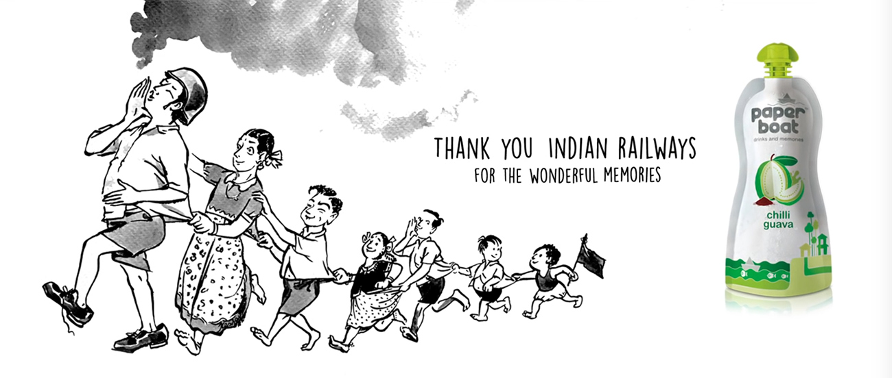
Seriously, it didn't even matter if the ad was "glossy." What mattered was: it felt like ours. Like, truly ours.
The Campaigns That Just Got Lost in the Sparkle (And Then, Failed)
Snapdeal’s Festive Campaign – All Flash, Zero Clue.
Okay, let's talk about Snapdeal's high-profile Diwali campaign. Bollywood megastars, cinematic production values through the roof. Everyone saw it.
But here’s the kicker, the one that’ll make you sigh: nobody remembered what it was actually for.
There was no clear, distinct message. No urgency. Zero strategic differentiation. It looked stunning—but Amazon and Flipkart, with their razor-sharp positioning and CTAs you couldn’t ignore, absolutely wiped the floor with it.
The moral? Pretty storytelling without absolute, laser-beam clarity is just noise. Really, really expensive noise.
Luxury Real Estate Ads on Instagram – Pretty Pictures, Wrong People.
I see these. All. The. Time. Countless real estate ads. Drone shots. Marble floors. Champagne brunches everywhere. And then, the captions, always in perfect English, obviously aimed squarely at NRIs.
But here’s the colossal miss: a ton of these properties are actually meant for Indian middle-class families. The ones who care about stuff like how far the school is, whether the EMI plan makes sense, and if the vastu is good. They're not exactly swooning over imported flooring.
These campaigns look elite. They scream "luxury." But they miss their actual audience by a mile. It’s like sending a Michelin-star menu to someone who just wants a great local street food experience. Totally off.
What "Pretty" Just Doesn't Tell You (And It's Kinda Important)
Looks Can Actually Push People Away. Seriously.
If your ad is too polished, too perfect, too high-end, people might instantly go: "Yeah, no. That's not for me. Way out of my league."
Think about that for a second. You're literally excluding potential customers just by how your ad looks. That is brand exclusion by design.
Over-Production? Can Absolutely Mute Real Emotion.
You know those super staged, perfectly lit "emotional" ads? Sometimes, they just fall flat on their face. They don't move people. Compare that to, like, a shaky, grainy phone video of a father unexpectedly surprising his daughter at a college hostel. Which one makes you tear up?
Emotion. It beats slick execution. Every. Single. Time.
What Smart Campaigns Always Get Right (Pay Attention Here!)
1. Speak to One Person. Not the Whole Crowd.
Great campaigns don't just stand there yelling: "Hey! Look at all the cool stuff we do!"
Nah. They lean in close and practically whisper: "Hey, here's exactly what you need."
They're specific. They're personal. And they hit you right when you need it. Timely.
2. Design? It's a Tool. Not the Boss.
Your visuals? They should always serve the message. Period. They should never, ever, ever overshadow it.
In fact, sometimes, less "design" actually equals more connection. Think about that.
That's why a simple WhatsApp forward about a blood donation drive often gets way more traction than some super fancy, designer poster. It just feels real. And often, that's enough. That's more than enough, actually.
3. Authenticity. That's the New Black.
Raw stories. Unpolished founder reels on Instagram. Shaky testimonials. Screenshots of real feedback. They're all absolutely crushing it right now because they feel genuine. They feel honest. Not like some perfectly staged, fake-looking scene.
And when people trust what they see? Guess what? They're way, way more likely to buy what you're selling. It's just how we're wired.
So, Stop Spending Time Obsessing Over How It Looks! Here's What to Do Instead.
Before you even think about the first draft, the first mock-up, or hitting "record" on that reel—stop. And ask yourself these tough questions:
- What specific pain point am I actually solving here?
- Who, exactly, am I talking to? Like, really really exactly? Get granular.
- What emotion do I want them to feel? Dig deep.
- What action do I need them to take? Be super clear.
- Why should the audience even care about this, right now, today? Give them a reason.
This is where strategy earns its absolute place. It's the first thing that walks into the room. Long before any pretty pictures even get a sniff.
Test, Tweak, and Then Do It All Over Again. And Again.
Even the most beautiful idea on paper is just a hypothesis. Until you actually test it.
Any senior marketer worth their salt knows this, to their core:
We don't trust our gut. We trust our data.
So, A/B test different kinds of content. Try that raw, shaky phone video against the super polished, expensive edit. See if a single, direct message works better than a fancy storytelling carousel.
You'll often be genuinely surprised. That "unpretty" idea? It might just blow your mind with its performance.
Why? Because it connected better. That’s why. Simple as that.
The Real Bottom Line, No BS.
Aesthetics? They're powerful, no doubt. But they are not the engine driving your success. Strategy is.
So, before you sign off on that next beautifully edited ad campaign, please, just ask one crucial question:
Does this thing actually serve my strategy—or is it just a shiny, expensive distraction?
Because at the end of the day, look, we're not here to win design awards, right? We're here to win markets.
Closing Note: Let’s Build What Works—Not Just What Looks Good
If you're a business leader, a founder, or just someone tired of all this surface-level stuff, here's what’s worth remembering, etched in stone:

Got a half-baked idea? A gut feeling you're not sure how to execute? Lets talk.
Share:


Previous Elevate
Ideas Are Easy. Execution Is Everything.Next Elevate
Marketing Isn’t a Quick Fix. It’s a Long-Term Play.Recent Elevates

Still Losing Visitors? Fix Your CTAs Now
09 July 2025

Ideas Are Easy. Execution Is Everything.
08 July 2025


.jpg "You don’t need to be a big brand to make a big impression")
You don’t need to be a big brand to make a big impression
07 February 2025


